Scroll inside table to reveal more content
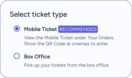
I will be referring to my idea as ‘Re-Watch’ from here.
Only BookMyShow and PVR INOX offered private booking for corporates ( not for public ).
None of the competitors offers a user-driven feature like ‘Re-Watch’.


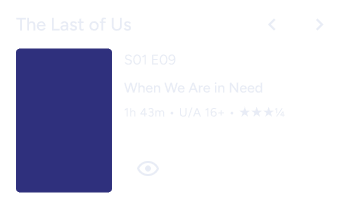
Audiences wanting to
Relive the theater experience for nostalgia or
Catch missed original releases.
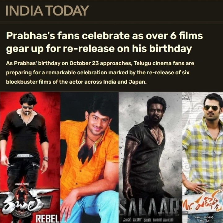
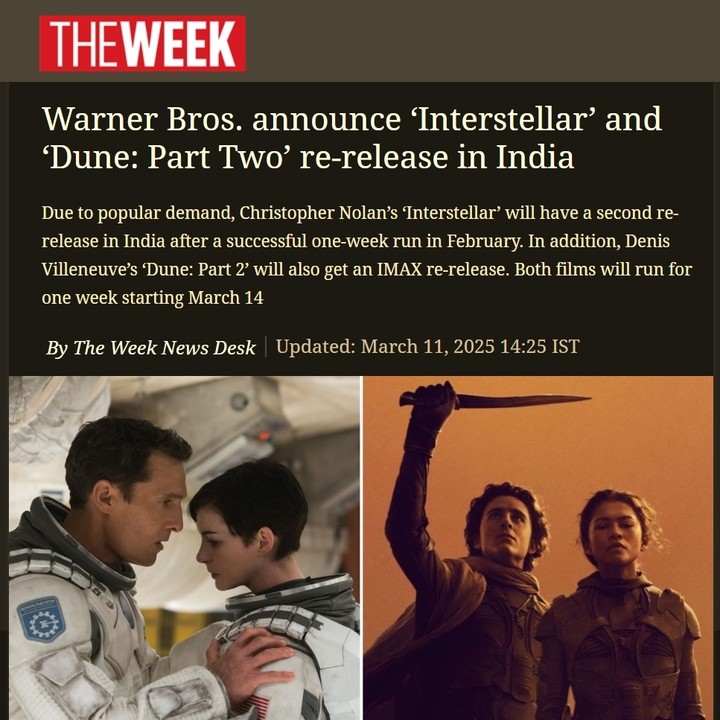
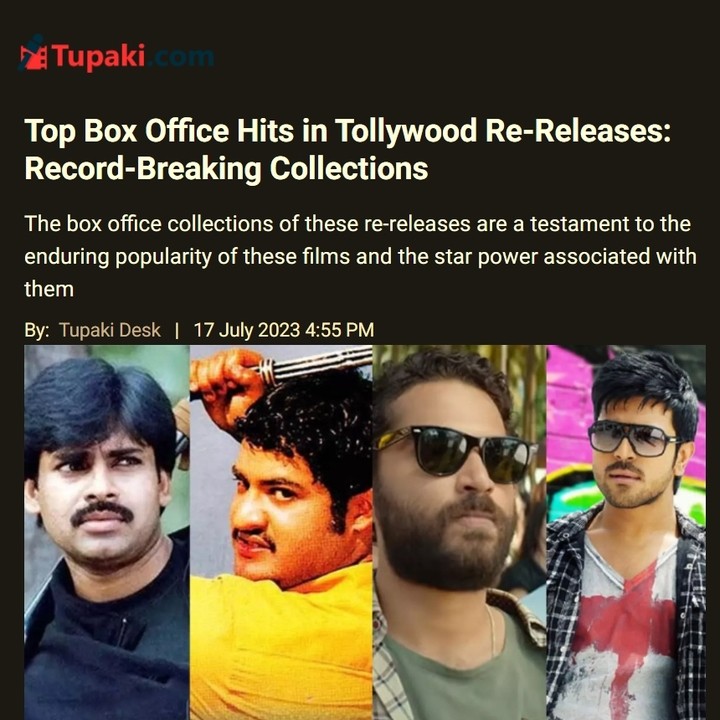
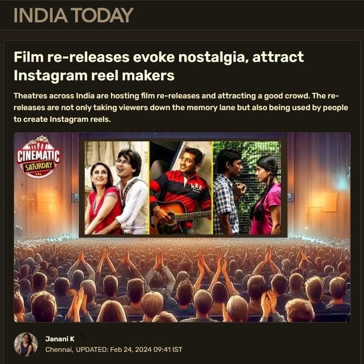
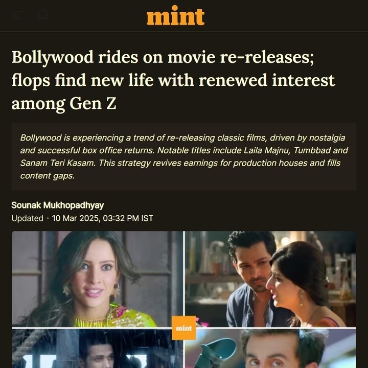
100+
Movies re-released in India in the last three years.
Google Playstore reviews of competitors revealed some key issues like:
Poor search options
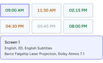
Theater screen details not shown beforehand
Rigid rating options
Poor privacy options and more
One funny thing was seeing hundreds of people rating the apps poorly because they offered no discounts.
“ This idea(Re-Watch) is good. I think it will be helpful to us to attract customers during less show ups due to no big films or flops. ”
“ All types of movies can be screened given that they are from a reputed production company. ”
- INOX Theater Manager
“If price is not an issue why not.”
“Is it available now? I would like to watch Taylor Swift Eras Tour”
- Interview participants
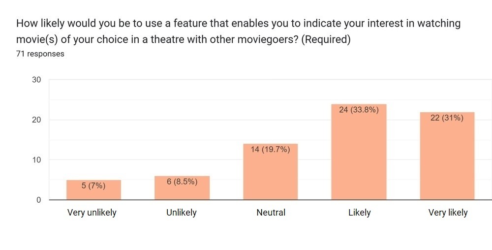
90%
of user interview participants and
65%
of survey participants see themselves using the 'Re-Watch' concept.


Go to the next image to view the sorted affinity map with problem groups listed. Glance at the headings like Navigation and Search for a quick overview of problem areas.
The Aakash and Maya personas, based on research findings, represent movie and TV show audiences. Explore their profiles to understand their goals and frustrations. View the next image for Maya’s persona.
These steps are summarized below for brevity due to their detailed nature.
User Journey Mapping: Created 6 journey maps (3 current, 3 future state) to identify pain points and envision ShowStop’s experience.
Problem Statements: Developed 8 problem statements from affinity mapping, with 1-3 “How Might We” statements each to guide solutions.
Competitors’ Heuristic Analysis: Evaluated 100 UI screens of competitor apps using Nielsen’s 10 heuristics to inform ShowStop’s design.
Brainstorming: Generated unbiased solution ideas for each “How Might We” statement to tackle 8 problem areas.
Prioritization: Selected top ideas based on feasibility, viability, and desirability for ShowStop.
Content Analysis: Reviewed competitors’ UI screenshots for fonts, text styles, and sitemaps to shape ShowStop’s information architecture.
Preliminary Sitemap: Grouped pages and information to create a preliminary sitemap to envision ShowStop’s information flow.
Taking reference from the preliminary sitemap, I created a tree structure to test the information architecture.
The first tree test (18 participants) had a 30.56% success rate, revealing unclear labels.

After adjusting labels, the second tree test (100 participants) achieved an
80%
Success Rate
confirming clear navigation.
View the updated sitemap below.
Scroll down to view full image


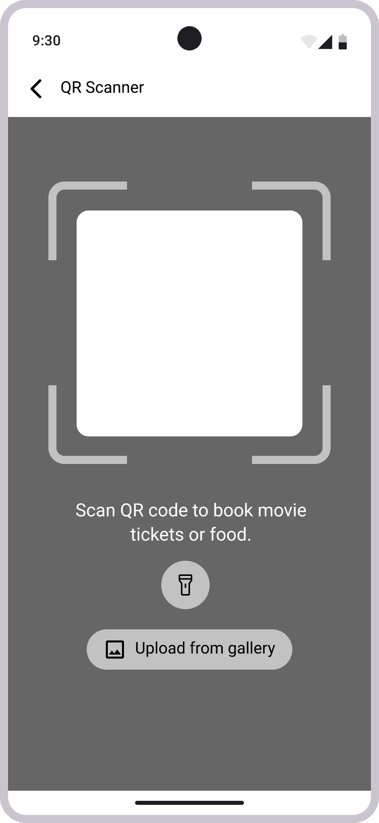
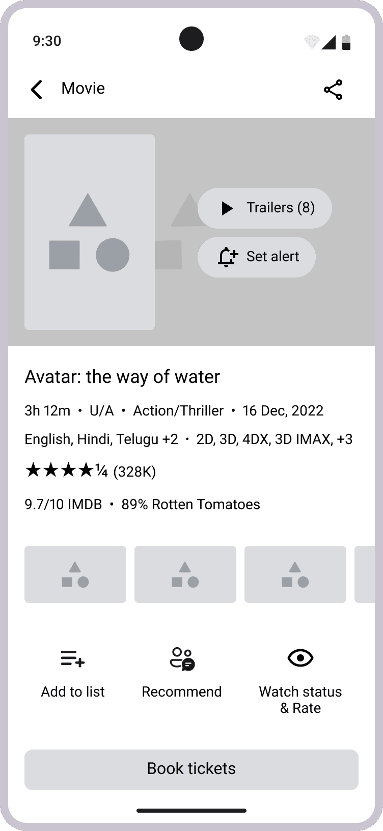
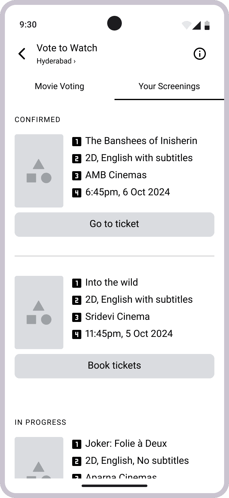
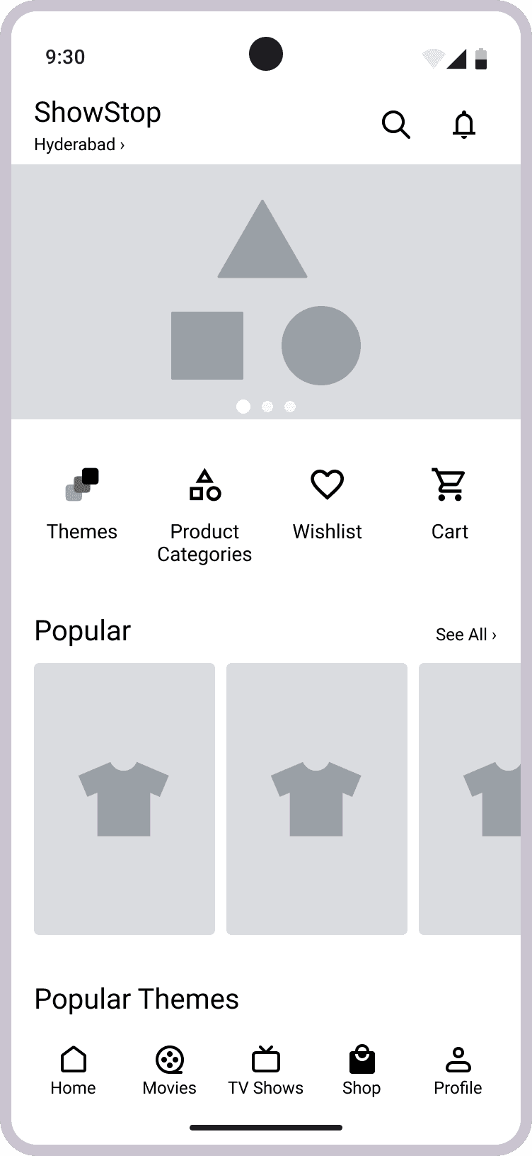
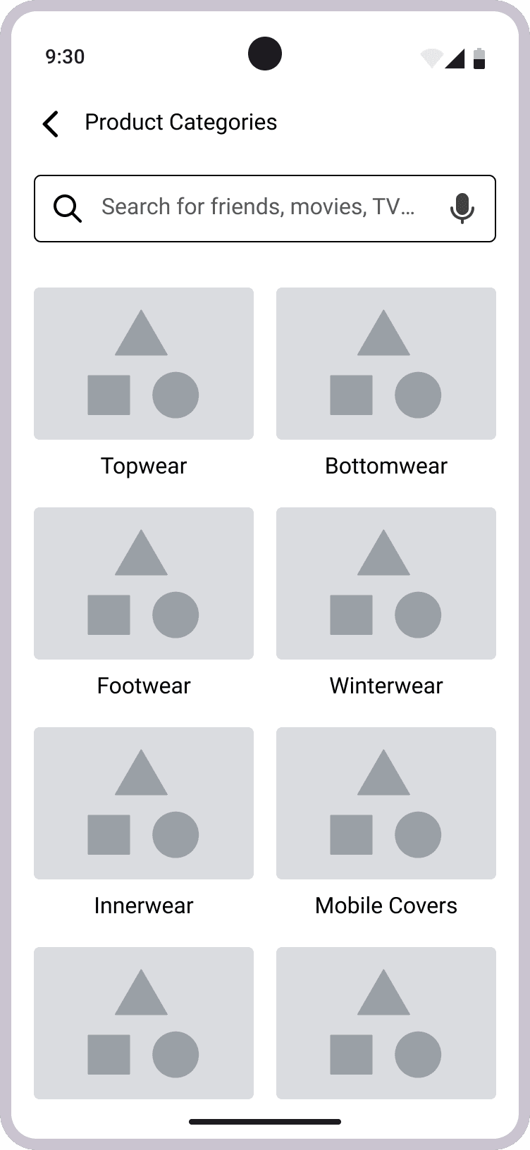
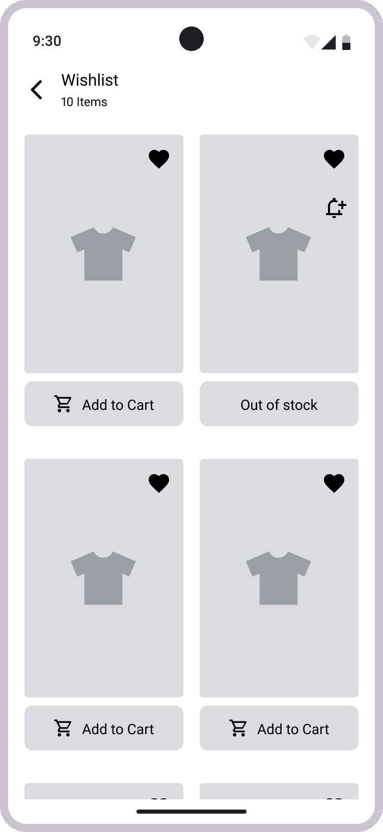
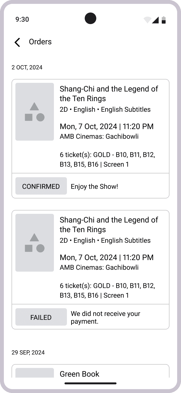
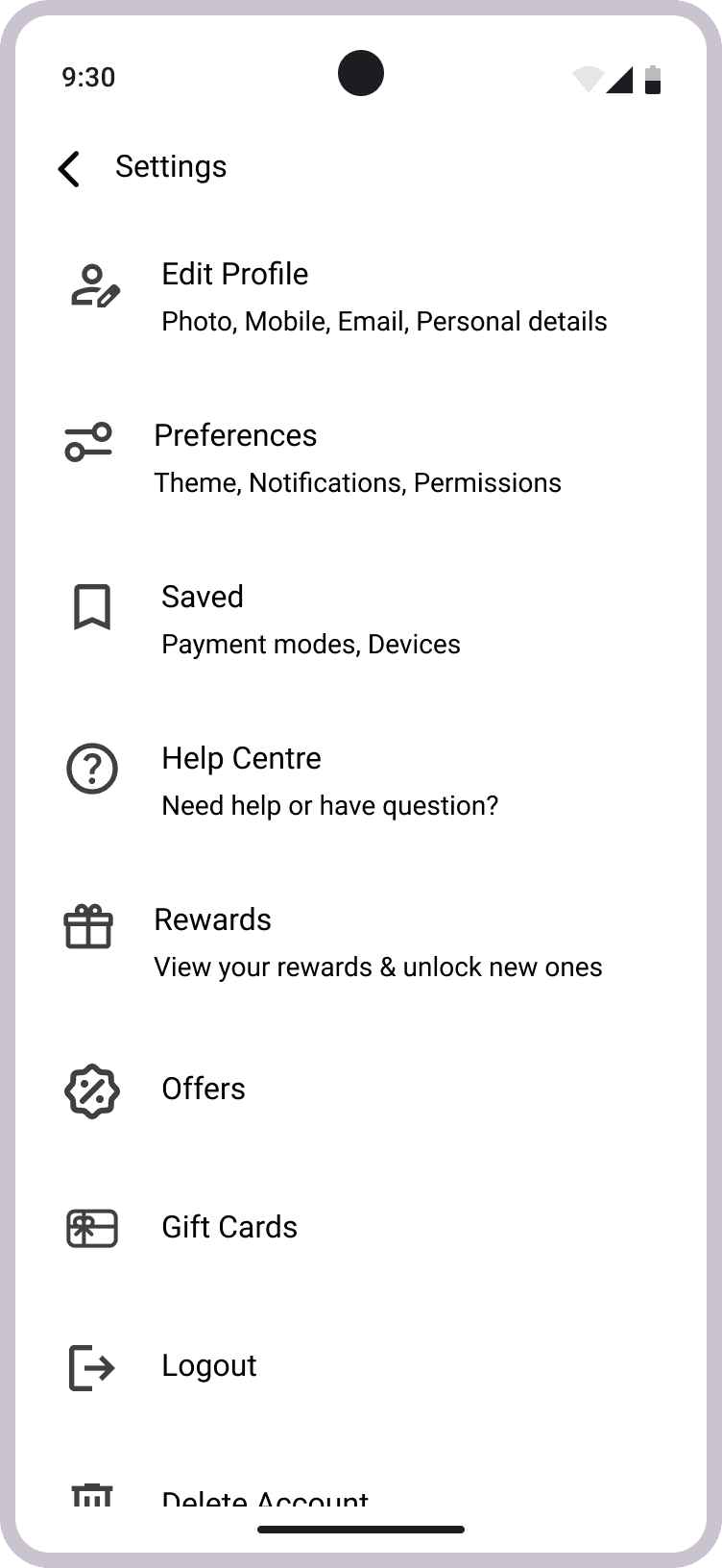
I sketched low-fidelity wireframes for regular pages and unique ones like Request Screenings, Now Watching, and Lists to visualize ShowStop’s core features. These drafts set the stage for mid-fidelity prototyping.


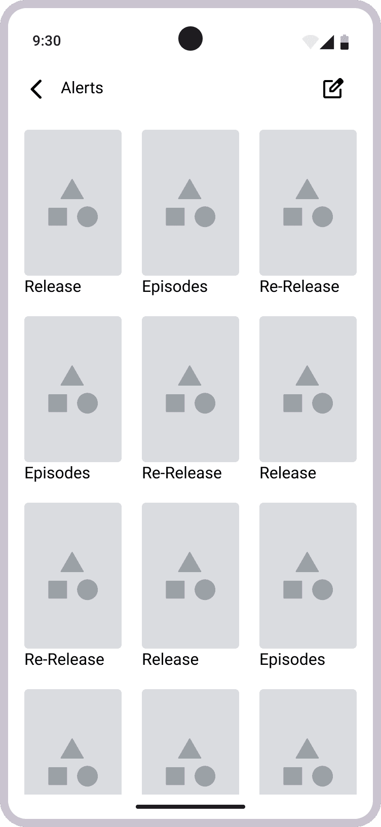
I created a mid-fidelity prototype of 32 screens, using minimal colors (white, black, greys) and a single font weight to eliminate reliance on visual cues, with real copy and interactive navigation.
Moderated usability test (5 participants, 5 tasks) at the food court opposite AMB Cinemas
90%
Overall task success rate


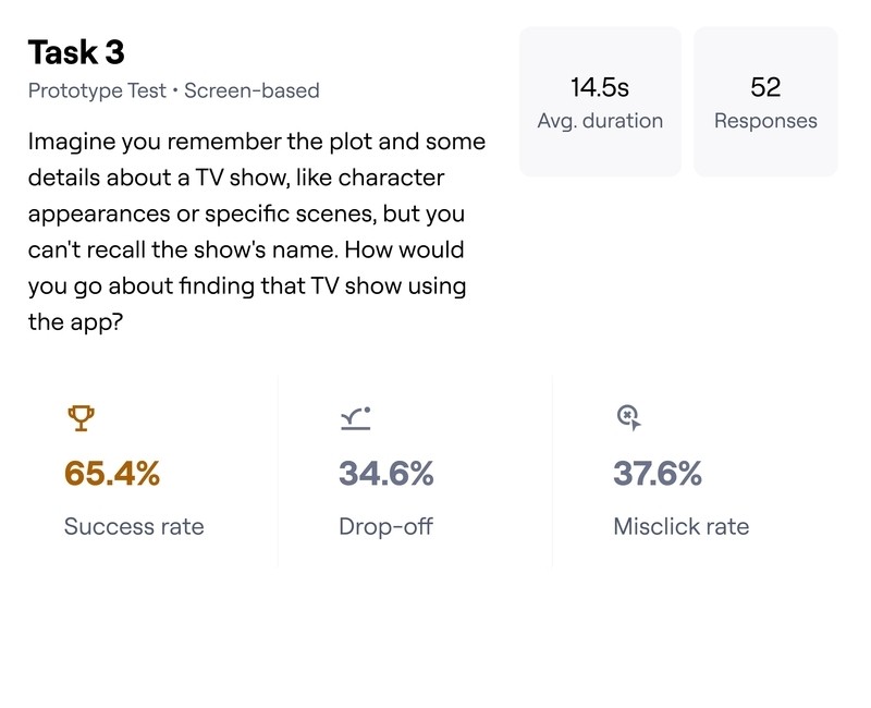
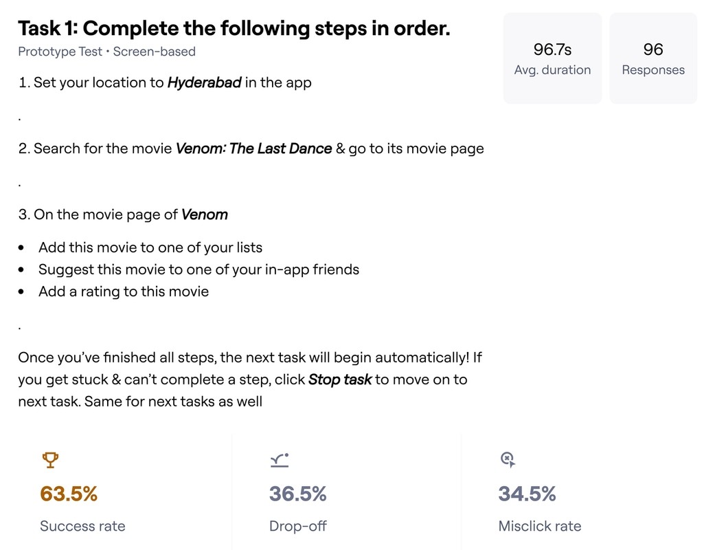
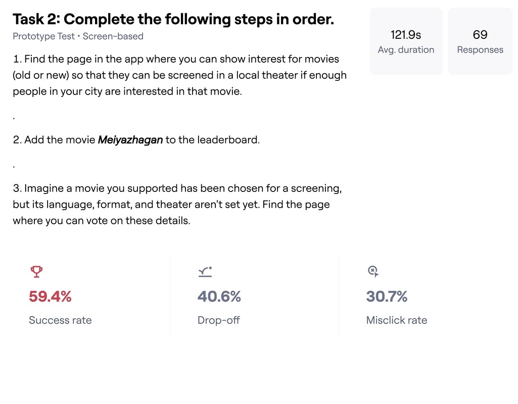
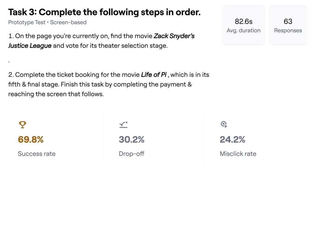
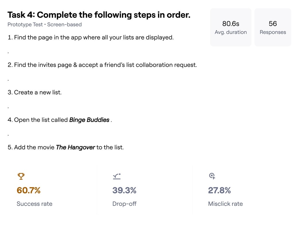
Refined the prototype based on insights, then ran an unmoderated usability test (50 completions) with 4 tasks.
Task results were decent despite drop-offs and mobile use challenges, as seen in the slideshow.
55%
Average Success Rate
Noted real issues for high-fidelity improvements.


I developed Ticket Design System, ShowStop’s official design language, adapting Google Material Design 3. It includes foundations (Color, Typography, Spacing, Elevation, Corner Radius, Breakpoints, Grids, Motion) and a UI library with 500 tokens and 400 components, built using an atomic approach (Atoms to Pages).


I designed ~300 high-fidelity screens across mobile, tablet, and desktop using Ticket Design System, with a fully interactive prototype.
Moderated usability test (10 participants, 15 tasks) at the food court opposite AMB Cinemas.
99.23%
Success Rate
Ran an unmoderated usability test (56 completions, 241 attempts).
High drop-offs occurred due to a resource-heavy prototype causing lag or failure to open, though users with capable devices achieved decent results, as seen in the slideshow.
63%
Average Success Rate
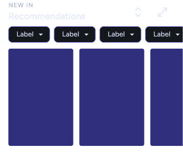
Screens


Scroll horizontally or verticllay to view all designs
Flows
Scroll horizontally to view all UI videos
ShowStop’s journey pauses here, usable, engaging, and brimming with potential for future refinements.